The Art of the Exit: Why, How, When to Sell

Every investor obsesses over buying. There are a thousand books dissecting what to buy, how to buy, and why to buy. Almost none dissects the other half of the equation: selling. Yet selling determines outcomes far more than entry points. It’s where conviction meets humility, where thesis meets feedback loop. In this piece, we’ll study selling from three angles, why we sell, how we sell, and when we sell, through the lens of professional money managers who’ve had to make those calls when the tape turned.
I used ChatGPT to help me draft this post (it’s 10,000+ words long) so some sentences may sound awkward, but don’t worry about it too much.
Even the most seasoned portfolio managers struggle with timing exits. Selling too late can erase months or years of gains, as euphoria quickly turns to panic in a major downturn. The key is that markets often telegraph their peaks with recognizable technical signals before fundamentals deteriorate. By sharpening our ability to read these signals - from classic price patterns to momentum shifts - we can avoid riding a winner back down. This is about preserving capital at euphoric extremes. Knowing when to sell is crucial for risk management and is often the difference between locking in profits or watching them vanish[1][2]. In bull markets, narrative and optimism reign, so technical cues are invaluable objective warnings when sentiment, valuations, and positioning reach an unsustainable fever pitch.
Stanley Druckenmiller once summarized George Soros’s philosophy on selling and position sizing with a lesson that shaped his entire career: “The way to build long-term returns is through preservation of capital and home runs. It is not whether you’re right or wrong that matters, but how much you make when you’re right and how little you lose when you’re wrong.” That mindset reframes selling as a discipline of asymmetry. Soros and Druckenmiller didn’t sell because they lost conviction; they sold to protect capital when the odds turned. They both used technicals for it.
In short, recognizing technical sell signals can help a portfolio manager sidestep major drawdowns and navigate the reflexive feedback loops of bubbles and busts that fundamentals alone might not flag in time[3][4].
Core Reasoning
Markets tend to peak on optimism, not obvious bad news. Fundamentals often still look strong at the top - earnings are high, the economy booming, and consensus narrative glowing. That’s why relying solely on fundamentals can be dangerous for timing exits. Technical analysis offers a real-time window into shifting supply-demand dynamics and investor psychology. Price and volume patterns reflect when big players quietly start distributing stock (selling into strength) even as retail buyers are still euphoric[5]. Momentum oscillators can reveal when a rally is running out of steam (e.g. weakening RSI/MACD even as prices push higher), foreshadowing a reversal[6][7]. Key support levels and trendlines, once broken, tell you the trend has changed before the news headlines do.
Importantly, technical sell signals often precede fundamental catalysts. A stock can look fundamentally cheap for months while its price keeps sinking - a sign that something is wrong. Conversely, at a peak, valuations may be extreme (P/Es sky-high, yields thin) but story and sentiment mask the risks. Savvy investors use technical signals as an early warning system to pare exposure when risk/reward flips, even if the earnings picture still looks fine. For example, deteriorating internal market breadth or a cluster of high-volume down days (“distribution days”) can tip you off that a bull run is nearing exhaustion, prompting you to trim positions before earnings or macro data confirm the turn. In short, technicals provide timing, while fundamentals provide the long-term rationale. The best portfolio managers integrate both: they might identify overvalued assets ready to sell based on fundamentals (e.g. stretched valuations, slowing growth), but execute the exit when technicals confirm the top (such as a major support break or blow-off volume spike). This blend helps avoid selling too early on mere valuation concerns (markets can stay irrational longer than you expect) or too late after the damage is done. Every claim here ties to price history, logic, or market behavior - no magic, just pattern recognition honed by decades of market cycles.
Historical Parallels - Lessons from Major Tops
History doesn’t repeat exactly, but it often rhymes. Let’s examine a few famous market peaks and the technical signals that foreshadowed their downturns:
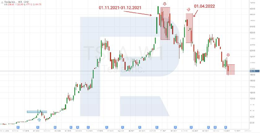
Tesla 2021: Tesla’s stock surged ~8x in 2020-21 amid EV euphoria. By late 2021, technical cracks formed even as bullish sentiment peaked. CEO Elon Musk began selling shares in November 2021, a fundamental red flag that coincided with a head-and-shoulders topping pattern on the chart[8]. The stock suffered multiple high-volume “distribution days” as it fell 16% on Nov 8, 2021 when Musk’s sales started[9]. After a brief rebound, Tesla broke its uptrend - a signal to trim exposure. Musk’s continued selling into year-end led to another 19% drop in December[10][11]. In short, insiders were selling, and price/volume action confirmed a top. The head-and-shoulders pattern on Tesla’s weekly chart warned of a trend reversal as early as Q4 2021[12]. Those who heeded these signals locked in gains; those who didn’t saw Tesla decline sharply from its November 2021 peak.
Cathie Wood’s ARKK 2021: The ARK Innovation ETF - emblematic of speculative growth stocks - peaked at $159.70 in Feb 2021[13]. Leading up to the top, many ARKK holdings were showing fatigue: negative divergences and failed breakouts. ARKK’s 50-day moving average - a barometer of intermediate trend - was decisively broken in March 2021, a technical failure that ended its meteoric rise. Notably, ARKK logged a cluster of distribution days as well, and by the time fundamentals (like rising interest rates compressing growth valuations) became obvious, ARKK had already tumbled over 30% from its high. In fact, ARKK fell 60% in the 12 months after its peak[14]. The key lesson was that extreme optimism and crowded positioning in innovative tech gave way to steady selling - visible in price action - well before the broader market rolled over.
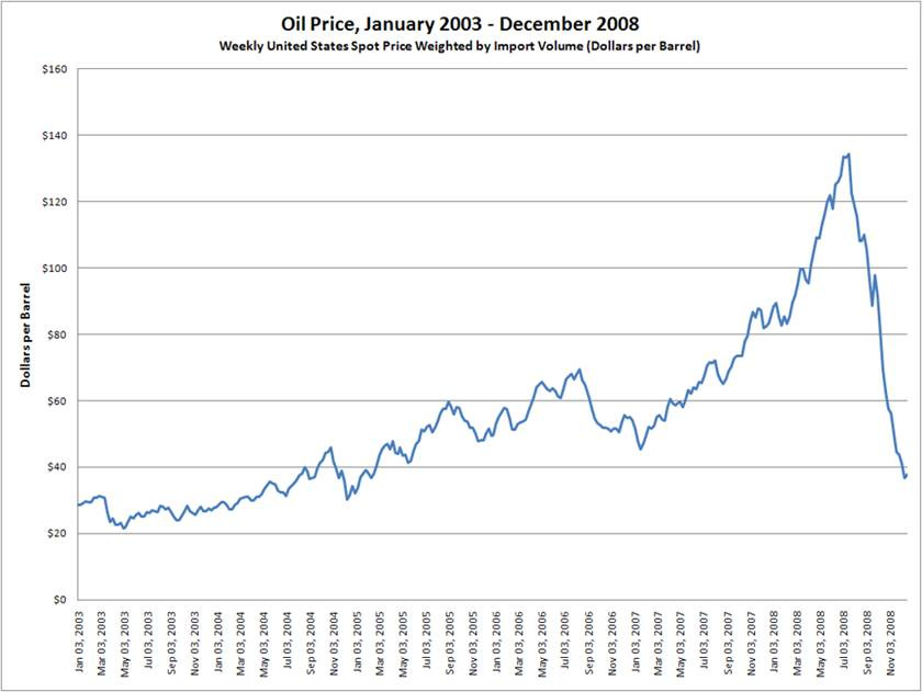
Crude Oil 2008: Oil’s rally in the mid-2000s went parabolic - from ~$90 in January 2008 to an all-time high of $147 per barrel by July 2008[15]. This blow-off top was marked by classic signs of exhaustion: price went near-vertical in June-July, volume in oil futures hit records as late buyers piled in, and momentum indicators like weekly RSI became severely overbought (above 80). Then came the reversal - crude plunged violently, dropping to near $120 just weeks after the peak, and ultimately crashing ~80% to the $30s by year-end[15]. The lesson: commodities often exhibit reflexive blow-offs (geopolitical fears and speculation in oil’s case) followed by rapid collapses. Savvy traders noted the climactic volume and price acceleration into July 2008 - a textbook “exhaustion rally” - as a signal to sell or even short oil. Once oil broke its steep uptrend line and key moving averages in mid-July, the trend definitively turned. Fundamental triggers (demand destruction, financial crisis) came later, but technicals gave a timely exit signal.
USD/JPY 2015: A multi-year uptrend in USD/JPY (U.S. dollar vs Japanese yen) accelerated in 2014-15, buoyed by divergent monetary policy (Fed tapering vs BoJ easing). The pair hit ~125.8 in June 2015, a level not seen since 2002. Technically, this peak featured a double-top style pattern when compared to the prior multi-decade high (near 125 in 2002), with a noticeable bearish RSI divergence on weekly charts - the price made a higher high in 2015, but momentum (RSI) made a lower high, signaling weakening trend strength. Sure enough, USD/JPY failed to break above that 125 resistance convincingly and began to roll over. When USD/JPY fell below its 50-day moving average and a well-defined trendline in mid-2015, it signaled that the uptrend was exhausted. Over the next months, USD/JPY fell over 10%, including a rapid 7% drop into the August 2015 “flash crash”[17]. A portfolio manager long USD/JPY for the macro trend could have protected profits by selling when those technical warning signs emerged (or at least hedged the exposure). The fundamental narrative (strong USD) only broke much later; the charts warned in advance that the bullish trend was ending.
Gold 2011: Gold’s decade-long bull market peaked at $1,921/oz in September 2011 amid Eurozone crisis fears and aggressive monetary easing. Technical signals abounded at this top. On the monthly chart, gold’s RSI reached an extremely overbought level above 80 - “a severe overbought condition seen only at major market extremes”[18]. Meanwhile, by late summer 2011, gold prices had rallied far above their long-term trend channel, and actually hit the upper boundary of a multi-year rising channel - a strong resistance point[19]. Daily charts showed a classic blow-off pattern: an exhaustion gap up in late August on record volume, followed by a sharp reversal (a key reversal day on 9/6/2011). Additionally, inter-market divergences confirmed the top: gold made new highs that autumn, but gold mining stocks (e.g. GDX) lagged and began falling - a sign of distribution. In fact, a “shooting star” reversal candlestick in mining stocks signaled institutional selling into strength, often a harbinger of a gold peak[20]. Sure enough, gold failed to hold its highs, broke its 200-day moving average in early 2012, confirming a bearish trend change, and entered a multi-year decline. The takeaway: extreme momentum readings and technical exhaustion signals warned that gold’s safe-haven rally was overdone. Those signals - combined with observation of miners and silver (which also peaked in April 2011 with a blow-off) - told you to sell the rip. Gold dropped about 45% over the next few years from its 2011 high.
These cases underscore that major tops aren’t random - they leave footprints in the charts. If we study these parallels (Tesla’s pattern, ARKK’s breakdown, Oil’s blow-off, FX double-tops, Gold’s climax), we gain a playbook for recognizing future tops early and exiting with profits intact.
Key Technical Frameworks That Flag Major Tops and Exits
1. Price and Volume Patterns - Topping Formations
Certain chart patterns are classic indications of distribution (smart money selling to latecomers) and impending trend reversals. The most notable include:
Head and Shoulders Tops: This is a conviction-grade reversal pattern. It consists of three peaks - a higher high (the Head) between two lower highs (the Shoulders) - with a flat or sloping “neckline” support connecting the interim lows. A break below the neckline completes the pattern and signals a downtrend. A head-and-shoulders top reflects a gradual shift from bullish to bearish: buyers push to a new high (head) but then cannot sustain it, and the right shoulder high is lower on waning momentum. Volume often diminishes on the head’s rally and swells on the declines, confirming distribution[21]. When you see a clear H&S, it’s often a timely sell signal - or at least a warning to tighten stops. For example, the S&P 500 formed a head-and-shoulders in late 2007 before the Financial Crisis; breaking its neckline in January 2008 was a definitive exit signal. Likewise, as mentioned, Tesla’s 2021 chart showed an H&S; traders who sold on the neckline break in early 2022 avoided much of the subsequent carnage. Technical textbooks regard head-and-shoulders as one of the most reliable reversal patterns, and for good reason: it encapsulates a shift from an uptrend of higher highs to a downtrend of lower highs[22][23].

Double Tops (and Triple Tops): These occur when price hits a high, pulls back, then retests the high and fails to break out. The result is a “M” shaped pattern. A double top signifies that an asset met heavy supply at a certain price twice - a sign the rally has run into a wall of sellers. The sell trigger is usually a break below the interim low between the two peaks. For instance, many tech stocks in 2021 traced double tops - making a high in Q1, rolling over, then coming close to the high in late summer but stalling, before plunging in Q4. A famous historical example: the NASDAQ Composite formed a triple-top style pattern in 2000 (peaks in March, June, and September) - once it broke support that fall, the dot-com bust ensued. Volume is important here too: double tops often show higher volume on the first peak and diminished volume on the second (a bearish divergence indicating fewer buyers the second time around). If you detect a double top and especially if momentum indicators confirm a bearish divergence, it’s a cue to start scaling out.
Distribution Days: Not a “pattern” per se, but a concept introduced by William O’Neil (IBD) that identifies institutional selling. A distribution day is when a major index falls significantly (e.g. >0.2% or >0.5%) on higher volume than the prior session[24]. It means big players were selling aggressively. A few distribution days are normal, but when you see a cluster of distribution days within a few weeks near market highs, it’s a red flag that the uptrend is under institutional distribution. For example, in late 2018, the S&P notched multiple distribution days before a sharp Q4 selloff. In early 2020 (February), a string of distribution days preceded the COVID crash. Typically, O’Neil’s rule is ~5 distribution days in a 3-week span often marks a market top. The presence of many high-volume down days indicates that despite indexes perhaps holding up, large funds are selling into strength. This is often invisible if you only watch price, but volume exposes it. So for a portfolio manager, noticing rising volume on down days - especially after an extended rally - is a sign to get defensive. In practical terms, you might start raising cash or hedging when distribution clusters, rather than waiting for an actual price breakdown. By the time price breaks, distribution has usually been going on for a while (smart money is often early). High-volume stalling sessions (where price closes flat-to-down after an early rally) are also part of distribution - a signal of churning and absorption of demand by sellers. To summarize: Repeated distribution days = get ready to sell.
2. Moving Average Failures - Trend Breakdown and Death Cross
Rallies in equities (and other assets) often ride on key moving averages. When those supportive moving averages give way, it’s a technical sell signal. Two critical ones: the 50-day and 200-day simple moving averages (SMAs), watched by a wide array of market participants.
Loss of the 50-day MA: In a healthy uptrend, the 50-day (roughly 10-week) moving average tends to act as a dynamic support - pullbacks find buyers there. When a stock or index falls below the 50-day and fails to quickly regain it, it’s often an early indicator that upside momentum is fading. For example, many momentum stocks that led the 2020 rally began breaking their 50-day lines in early 2021 - a cue to reduce exposure. A breach of the 50-day is not always catastrophic on its own (sometimes it’s just a deeper correction), but it warrants caution and tighter stops. More bearish is when rallies start failing at the 50-day from below (what was support becomes resistance) - that pattern often precedes larger declines. If you see an asset repeatedly unable to reclaim the 50-day, it’s a sign to exit remaining longs, since the intermediate trend is now down.
Break of the 200-day MA: The 200-day is a longer-term trend demarcation. When price violates the 200-day for the first time in a long bull run, it often signals the bull is over. Funds that only hold stocks in uptrends might use the 200-day as a hard sell rule. Importantly, a break of the 200-day accompanied by other evidence (pattern breakdowns, volume spikes) confirms a major trend change. A great example: the Nasdaq in March 2020 - once it sliced its 200-day during the pandemic panic, that confirmed the end of the prior uptrend (though the bear market was unusually brief in that case). Another example: the S&P 500 in early 2022 fell through its 200-day, signaling the end of the 2020-21 bull phase. Historically, most bear markets begin with the indexes dropping below their 200-day averages. Thus, for selling, if an asset that you’ve ridden higher closes below the 200-day and especially if it retests it as resistance and rolls over, that’s often a final cue to get out. Even if you miss selling the top, exiting near the 200-day can save you from much deeper losses.
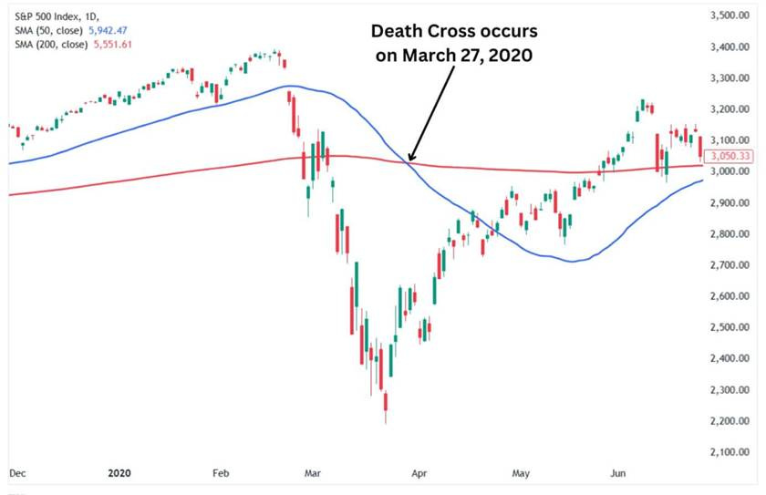
Death Cross (50-day crossing below 200-day): This is a specific moving average crossover that attracts a lot of press. A death cross occurs when the 50-day MA drops below the 200-day MA, indicating a shift from uptrend to downtrend in price structure[25]. While the death cross is a lagging signal (by the time it happens, a stock may be well off its highs), it does confirm a sustained trend change if not quickly reversed. Some long-term investors use it as a trigger to lighten up if they haven’t already. For instance, many global indices flashed death crosses in early 2008, late 2015, and early 2020. In each case, using the death cross alone might have had you selling a bit late, but still near relatively elevated levels before far worse declines ensued. There is a caveat: death crosses sometimes produce head-fakes (the market bottoms shortly after, making it a contrarian buy). In fact, since it’s so lagging, a death cross can mark capitulation - e.g. the S&P’s March 2020 death cross occurred after the bottom was in[26]. So we must treat it as confirmation of a downtrend, but not a guarantee of more downside. Still, if you haven’t sold yet by the death cross, strongly consider it - at least for reducing positions - because it shows the longer-term momentum has flipped bearish.
In practice: A portfolio manager might use a tiered approach - e.g. sell 1/3 of a position on a decisive 50-day break (especially if accompanied by other negatives), another 1/3 when the 200-day breaks, and the rest if a death cross and other bear signals confirm. This way you lighten up as the evidence mounts. The key point is that when a strong uptrend can no longer hold its moving average supports, the trend’s character has changed from buy-the-dip to sell-the-rally.
3. Momentum Divergences - Fading Trend Strength (RSI, MACD)
Momentum oscillators like RSI (Relative Strength Index) and MACD can provide early warning that a rally is running out of steam even as price marches to a final high. A bearish divergence occurs when price makes a higher high, but the momentum indicator makes a lower high. This indicates diminishing buying power - the trend is “long in the tooth.” Negative divergences often precede or coincide with major tops:
RSI Divergence: The RSI measures the speed and magnitude of price moves (overbought/oversold conditions). When an asset’s price hits a new high but the 14-day RSI is lower than on the previous high, it’s a classic bearish divergence[6]. It signals that the recent advance lacked the momentum of the prior leg. This often happens in late-stage rallies: e.g. the S&P 500 in November 2021 made a new peak while RSI was lower than on earlier peaks - a sign of waning momentum that foreshadowed the 2022 pullback.
Another example: Bitcoin in late 2021 had a glaring RSI divergence (price made a higher high in November, RSI was much lower than at the April high), warning of a trend reversal - indeed, Bitcoin then fell into a bear market. An important aspect: divergences can last a while (prices inch higher on weakening momentum for weeks before falling off), so they are a warning to prepare, not necessarily an immediate action signal. But if you have large profits, a bearish RSI divergence is a good excuse to take some off the table or at least not add more. Many top-callers were early, but those armed with divergence analysis tend to be less euphoric near peaks. Academic studies and decades of trader experience confirm that negative RSI divergences often occur before market downturns, though not every divergence leads to a crash (sometimes just a minor correction)[29][30]. The context and other signals matter.
MACD and Other Oscillator Divergences: The MACD (Moving Average Convergence Divergence) is another momentum/trend indicator. A typical bearish divergence is when price logs higher highs but the MACD histogram peaks at lower highs or the MACD line itself is lower[31]. This often mirrors what RSI shows - a loss of internal strength. For instance, in the Dow Jones Industrials October 2007 top, there was a notable MACD divergence on weekly charts. As the index crept to a new high, MACD made a lower high and actually gave a bearish crossover shortly after - a signal that proved prescient as 2008 unfolded. Other oscillators like Stochastics or CCI similarly can show divergences. The specific tool is less important than the message: buyers are getting tired.
What to do when you see a divergence? Generally, it’s a heads-up to tighten stops, reduce exposure, or at least stop adding to positions. Some traders will sell partial positions on a confirmed divergence (e.g. price turns down after the divergent high). As Investopedia notes, “a bearish divergence can prompt a trader to consider selling or shorting after confirming the trend is turning... some use divergence as a signal to take profits or exit an existing position before a reversal erodes gains”[7]. That nails it - divergences are about being proactive. By the time the bad news hits or earnings disappoint, the stock might already be off 20%. But divergence was hinting at the turn beforehand.
It’s worth emphasizing that not every top will show a neat divergence - sometimes blow-offs happen with momentum extremely high (no divergence until after the peak). In those cases, other indicators (like volume climax) might be more useful. But when divergences do appear in a mature rally, heed them. They reflect the reflexive nature of markets: as prices climb, eventually fewer groups are buying (diminished breadth) and each incremental high comes on weaker internals - a telltale sign of an aging trend.
4. Trendline and Channel Breaks - Bending Until It Breaks
Uptrends often follow well-defined trendlines or price channels. As long as the trendline holds (with each dip finding support along that line), the primary trend is intact. A break below a long-standing trendline is a straightforward technical signal that the trend is likely over or at least entering a new phase. For example:
Trendline Break: Draw a line connecting the higher lows of a rally (for a channel, also connect the higher highs). When price decisively pierces below this rising support line, it often triggers accelerated selling - both algorithmic and discretionary traders notice such breaks. A trendline break usually precedes a moving average crossover (since it’s an earlier event) and can be used as a nimble sell trigger. The significance depends on which trendline - breaking a short-term one might just mean a minor correction, but breaking a multi-month or multi-year trendline is a huge deal. The longer and more times tested the trendline, the more potent the sell signal when it cracks. For instance, the Nasdaq’s 45-degree ascent from 1995-2000 had an immaculate trendline - which broke in April 2000, even before the 50-day/200-day MAs did, providing a timely exit from tech stocks. Similarly, many growth stocks in 2021 broke their 6-12 month uptrend lines around February, which was an early clue to get out.
The logic is simple: as long as demand outstrips supply, the uptrend line (representing the trajectory of price) holds. Once supply overcomes demand, price can’t maintain the uptrend angle, and the line breaks - signaling the balance has shifted to sellers. As one trading guide succinctly states: “A break of the trendline often signals a potential reversal or trend weakening, prompting traders to exit or reverse their positions.”[32].
Channel or Trend Band Break: Many uptrends trade in parallel channels - for example, an index climbing steadily within an upward-sloping band. If the price falls out of that channel (especially on high volume or a gap down), it’s an alert that the trend’s rhythm has changed. An initial violation might sometimes be a false alarm, but usually if the channel was well-established, falling out of it suggests an uptrend slowdown that can lead to a downtrend. One can look at slope too: sometimes before breaking down, an uptrend might flatten (lower slope) - that can be an early sign of distribution as well (fewer higher highs). But the definitive sign is breaking the support line that “defined” the rise.
Retests and Failed Recoveries: A savvy trader might wait to see if a broken trendline is quickly recovered (sometimes called a “bear trap”). If not - if bounces fail at the underside of the old trendline - that provides added confirmation to sell. For example, suppose a stock breaks its year-long uptrend line, drops 10%, then rallies. If that rally hits the underside of the old trendline or the 50-day MA and rolls over, that’s confirmation of a trend change. At that point, the prudent move is to sell remaining shares if you haven’t already.
Using trendline breaks is straightforward and effective across asset classes - currency pairs, commodities, equities - all tend to respect trendlines during sustained moves and often accelerate once those are broken (as stops trigger). A risk in practice is false breaks (whipsaws), but generally, a break accompanied by volume or volatility expansion is reliable. For instance, the 10-year U.S. Treasury yield had a well-defined downtrend line from 2018 to 2020; when it broke above that line in early 2021, it signaled an end to the ultra-low rate trend and presaged a bond sell-off (which indeed happened). In equity terms, think of 2020’s leaders like Zoom - once its steep channel broke in late 2020, that was the signal that its ride was over.
5. Failed Breakouts and Supply Zones - Bull Traps That Precede Downtrends
A very frustrating scenario for bullish investors is the false breakout, also known as a “bull trap.” This is when price appears to punch through a resistance to new highs - seemingly a bullish continuation - but then quickly reverses and falls. Failed breakouts are potent sell signals because they indicate buyers were overzealous and got trapped, and now sellers are in control.
Key aspects to watch:
Low-Volume or Weak Breakouts: A healthy breakout to new highs should occur on strong volume and follow-through. If a breakout occurs on suspect volume and stalls, be wary. As Investopedia notes, “bull traps can lead to significant losses if traders act on false breakout signals without seeking confirmation... recognizing early warning signs, such as low volume during breakouts, can help traders avoid bull traps”[33]. So if you see your stock or an index poke to a record high but volume is below average and the price isn’t accelerating, it could be a head-fake. If the next day it slips back below the breakout level - that’s your cue to sell (or even short) because supply overcame demand. Failed breakouts essentially mark the point of maximum bull optimism followed by a sudden victory of bears.
Reversal Candlesticks at New Highs: If a breakout day (or week) ends up printing a reversal pattern - like a doji or shooting star or bearish engulfing - that’s a sign the breakout failed. For example, a stock gaps to a new high in the morning but by the close prints a long upper wick and closes down - that indicates a bull trap. The psychology: early breakout buyers are now stuck (“trapped”) as price reversed, and they may rush to the exits, adding fuel to a new down move. A famous instance: in gold 2011, after breaking $1,900, gold formed a shooting star candlestick; that was effectively the top as it reversed afterward[20].
Established Supply/Resistance Zones: Often, a false breakout happens at a well-known resistance zone. The asset may trade above resistance intraday or for a few days, luring in breakout traders, then fail. If an asset cannot sustain trade above a known supply level, it tells you that sellers are using that area to offload shares. Supply zones (areas with previous peaks or heavy volume in the past) can thus act as selling opportunities. For instance, the euro (EUR/USD) had a supply zone around 1.20 in 2018 - when it rallied back there in 2021 but failed twice to clear it, those were bull traps that presaged a downturn in EUR.
In practical terms, how to act: If you are long and see a breakout fail, you might sell on the break back below resistance or below the prior day’s low (confirmation of failure). It’s better to exit and preserve profit than hope it was a fluke. Bull traps often lead to swift declines because all those who bought the “breakout” rush to sell. The earlier quote underscores this: traders should seek confirmation after a breakout (higher highs, volume, etc.). If those don’t appear, be suspicious. As Investopedia puts it, “the best way to handle bull traps is to recognize warning signs ahead of time - e.g. low-volume breakouts - and exit the trade as quickly as possible if a bull trap is suspected”[34][35]. Use stop-loss orders just below breakout levels to automatically protect yourself - if it’s a true breakout it shouldn’t hit your stop; if it’s false, you’ll be out with minimal damage or preserved gains.
One more hallmark: a false breakout often creates a “pop-and-drop” move - up through resistance and then an emphatic drop. If you ever see an index or stock make a new high and then lose that high ground and go red in short order, it’s a huge momentum shift. That’s often a time to sell aggressively. It indicates a rejection of higher prices. Failed breakouts in broad indices can mark bull market tops (e.g. the Dow’s marginal high in 2007 was a bull trap that reversed sharply).
In summary, failed breakouts = evidence of heavy supply. When you spot one, shift from offense to defense. It means the last buyers have likely bought, and now the path of least resistance is down.
6. Exhaustion Gaps and Volume Climaxes - Signals of a Blow-Off Top
Sometimes markets end with a bang - a final euphoric surge often marked by gap-up opens, huge volume, and a rapid rise followed by a sharp reversal. These are textbook climax tops, and recognizing them in real time is challenging but incredibly valuable for selling near the peak. Key signatures:
Exhaustion Gap: This is a gap (upward price gap on daily chart) occurring late in an extended uptrend, and it signals a last gasp of buying[36]. Unlike breakaway gaps (which start a move) or runaway gaps (which occur mid-trend), an exhaustion gap happens after a steep advance when sentiment is extremely bullish. It often comes out of nowhere - a big jump on some news or just feverish sentiment - but crucially, there’s no follow-through after the gap. Price might jump 5-10% overnight to a new high, but then stalls or reverses in the ensuing days. That is a clear sell sign. The gap essentially “emptied the tank” of buyers. Technicians watch for this especially in parabolic moves. For example, many Chinese tech stocks in February 2021 had huge gap-up opens on peak volume and then immediately started falling - classic exhaustion gaps. The definition per technical manuals: “an exhaustion gap occurs near the end of a price pattern and signals a final attempt to hit new highs, reflecting a significant shift from buying to selling as demand dries up”[37][36]. If you see an exhaustion gap, you should be selling into it (if not before), because it may mark the exact inflection point.
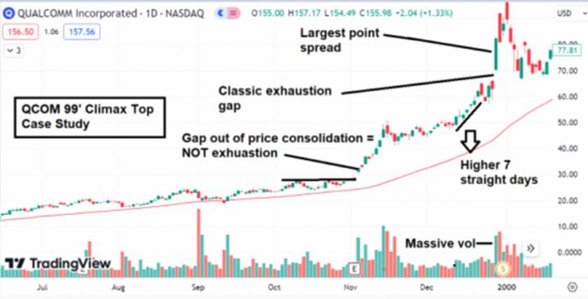
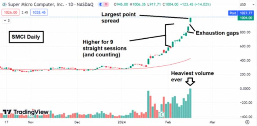
Climactic Volume Spike (Blow-off Volume): A volume climax is when trading volume explodes to many times average on the final rally. It indicates capitulation by shorts and a frenzy by late buyers, leaving nobody left to buy. William O’Neil, who studied climax runs, noted that often a leading stock’s largest one-day point gain and highest volume will occur at the end of its advance[38][39]. For instance, Qualcomm (QCOM) on Dec 29, 1999 jumped 39 points in one day on 142% of its average volume - its largest price jump and huge volume - a classic climax top day. It gapped up (exhaustion gap) and that marked the peak; QCOM never revisited those highs for decades. The combination of price surge + record volume = last buyers in, shorts squeezed out[40][41]. After that, only sellers remain. As a PM, when you witness a truly climactic day - say your stock that’s been soaring goes vertical with an outsized range and volume 4x normal - do not ignore it. It’s likely a blow-off. Maybe you won’t sell your entire position if fundamentals still seem good, but at least lighten up significantly. A real-world recent example: Super Micro Computer (SMCI) in early 2024 - it rallied over 3x in a few months, then in Feb 2024 it had 9 straight up days (nearly +100% in two weeks) on massive volume, including some gap-ups. That was a clear blow-off move. Sure enough, March 8, 2024 it peaked and then crashed in the following months. Those who sold into that frenzy kept their gains; those who didn’t round-tripped a lot of profit. Volume is the telltale - if you see the heaviest volume ever and a huge price extension, that is often the terminal rush. As one trader quipped, “when you see volume go insane on a vertical price spike, ring the register.”
Steep Weekly Run and Reversal: Beyond daily patterns, look at the weekly chart. Climax tops often show up as one or two giant weekly bars up (often closing off their highs), sometimes with a long upper wick if a reversal occurred. If a stock that usually moves +/-5% a week suddenly jumps 20%+ in a week or two, that could be its exhaustion run. O’Neil’s rule of thumb: if a stock is up seven or eight days in a row or two-three weeks in a row at an accelerating rate, it may be climaxing[42]. The sell rule he gave: “Sell if a stock’s advance gets so active that it has a rapid price run-up for 2-3 weeks on a weekly chart, or for 7 of 8 days in a row on a daily chart”[43][42]. This is basically describing a vertical ascent. Such runs are almost never sustainable - they invite a reversal due to profit-taking or simply exhaustion of buyers. Thus, as hard as it is emotionally, one should sell into that strength. It’s counterintuitive (greed will tempt you to think the stock is a rocketship), but professional discipline says to scale out. Remember: when everyone else is buying in a frenzy, who’s left to buy tomorrow?
In both images above, and many historical cases (gold 1980, silver 2011, GameStop 2021, etc.), the ingredients of a blow-off are similar: steep ascent, record volume, final gap up, then reversal. The reflexivity concept plays heavily here - the faster price rises, the more it convinces everyone it will keep going, until it simply can’t. Price action feeds on itself until the loop breaks[3][44], and when it breaks, it’s devastating for late buyers. That is why volume climax and exhaustion signals are the professional’s cue to get out - you sell to the euphoric final buyers.
In summary, as a portfolio manager, you should internalize this: If you’re lucky (or skillful) enough to own something during a blow-off rally, don’t wait for a bell to ring - the volume and price spike IS the bell. Sell into strength when the signs of climax appear, because once the turn happens, liquidity can dry up fast. Better to be a bit early than a day late in a climax scenario.
Applying These Signals Across Asset Classes: Equities, Commodities, and FX
The beauty of technical analysis is that human psychology leaves similar fingerprints on price regardless of the asset. However, different asset classes have their nuances:
Equities: Stocks are prone to many of the patterns discussed - head-and-shoulders tops, double tops, etc., are common on individual charts and indexes. Volume analysis is most straightforward in equities, since trading volumes are directly reported. Thus, concepts like distribution days and volume climaxes are particularly useful for stocks and stock indices. For example, a cluster of distribution days on the S&P 500 or NASDAQ is a clear warning of institutional selling in equities[5]. Equity sectors and broad indexes also often form major reversal patterns (e.g. many banks showed head & shoulders tops in 2007). Equities also exhibit reflexive overshoots (consider meme stocks like AMC/GME in 2021 - pure blow-off patterns). One nuance: equity markets have circuit breakers and can have rotational behavior - e.g. one sector tops while another rises - so sometimes index-level signals may lag individual stock signals. But by and large, the technical sell signals discussed apply cleanly to stocks. When Apple or Amazon break their 200-day MAs or key trendlines after long uptrends, it’s as bearish for those stocks as a similar break in any market. Equity portfolio managers also combine fundamentals (say, overvaluation) with technical triggers (like bearish divergences) to decide when to dump a high-flyer.
Commodities: Commodities (oil, gold, copper, etc.) often have more pronounced boom-bust cycles due to inelastic supply and speculative flows[45][46]. They are especially prone to blow-off tops. Just as we saw with crude in 2008 and silver in 2011, commodities can rise parabolically and then crash, since there’s no balance sheet or dividend - it’s purely supply/demand and psychology. Technical signals in commodities can be extremely valuable because fundamentals (inventories, production) often lag and don’t warn of a turn until after prices reverse. However, one nuance: commodity futures volumes can be harder to interpret (spread across contracts), and things like open interest and commitment of traders (COT) data are also used. But patterns like parabolic trendline breaks, RSI extremes, and key reversal days are very applicable. For instance, gold’s RSI >80 in 2011 on monthly chart was a huge outlier, screaming an overbought market[18]. Commodities also respect moving averages - e.g. many traders sold gold when it broke its 200-day in January 2012, which proved wise. Trendline breaks in commodities (like a long uptrend in corn breaking) similarly signal trend shifts. One should note that commodities are influenced by external factors (OPEC decisions, weather, geopolitics) which can cause gaps and volatility, so risk management is crucial. But technicals often telegraph even those events (the charts will often weaken before a major bearish fundamental development, as insiders or smarter traders anticipate it).
Forex (FX): Currency markets are huge and often trend strongly on macro themes. Volume data is decentralized in FX, so FX traders rely more on price action, momentum, and pattern analysis without volume confirmation. Thus, signals like divergences, trendline breaks, and moving average crosses carry weight. For example, when USD/JPY or EUR/USD complete a multi-month topping pattern or break a major trendline, it often reflects a shift in interest rate expectations or capital flows before central bank policy visibly shifts. A case in point: USD/JPY 2015’s double top and divergence we discussed - that signaled a turn from USD strength to weakness versus yen, even as policy divergence narrative was still “strong USD”. FX is also prone to false breakouts (“fakeouts”) around big round levels. A currency might poke above a resistance like 1.20 on EUR/USD only to fail - technical traders will recognize that bull trap and sell, knowing that in FX especially, failed breakouts can lead to rapid moves as positions unwind. Trend changes in FX can be very persistent (currencies can trend for years), so catching a top via technical signals can mean avoiding a long grind lower. It’s notable that many systematic global macro funds incorporate simple technical rules (like moving average crosses) for FX because they realize fundamentals alone (interest rate differentials, etc.) don’t tell the whole story. The Brexit vote in 2016, for instance, caused a massive breakdown in GBP/USD - but interestingly, GBP had been in a downtrend and below its key MAs well before the vote; technical weakness presaged that risk. The main caution in FX is whipsaws - currencies can be range-bound for long periods, so you might see multiple head-fake moves. Thus, confirmation across timeframes is useful (e.g. a trendline break on daily and weekly charts is stronger). Nonetheless, the core signals - divergence, pattern breaks, moving average flips - are absolutely applicable to FX.
Others (Crypto, etc.): Although not explicitly in the prompt, a quick note: Crypto markets, being 24/7 and sentiment-driven, behave a lot like commodities or high-beta tech stocks. They exhibit spectacular blow-offs (Bitcoin 2017, 2021) and crashes. Technical signals have proven very useful there too (e.g. Bitcoin’s 2017 top showed a classic parabolic trendline break and weekly RSI divergence). So any asset with human trading behavior will show these patterns to some degree.
In all asset classes, reflexivity and trader behavior create similar patterns. Fear and greed are universal. Greed produces the patterns of overextension (divergences, climax runs), and fear shows up in breakdowns and rush-for-exit moments. The main difference might be speed and volatility. Equities and commodities can gap, whereas FX tends to move more continuously (except in extreme events). But a trendline break is a trendline break - whether on a stock or a currency, it reflects a change in flow. A moving average crossover on a commodities index or an FX pair conveys shifting momentum just as it would on an equity index.
One must adjust tactics (e.g. using stop-loss orders in overnight futures vs during equity hours, or accounting for geopolitical event risk in commodities/FX). Yet, the core technical sell principles hold across markets: when the rhythm of higher highs and higher lows stops, when support zones give way, when momentum wanes, and when buyers exhaust themselves, it’s time to exit, whether you’re trading Apple, oil barrels, or yen.
Risks and Reversals - Navigating False Signals and Whipsaws
Technical analysis is powerful, but it’s not foolproof. A huge part of mastery is knowing that no signal guarantees an outcome - it’s about probabilities and risk management. Here are some caveats and how to handle them:
Bull Traps vs. Bear Traps: We’ve talked about bull traps (false breakouts). The inverse are bear traps - false breakdowns. A stock might break a support briefly and trigger sell signals, only to recapture it and squeeze higher. These false moves can whipsaw sellers. For example, an index might dip below its 200-day for a few days (flashing a “bear market” signal) then recover as a news-driven V-shaped rebound occurs - trapping bears. The best defense is to wait for confirmation and not act on single indicators alone. If a breakdown lacks volume or doesn’t close the week below support, be cautious. Also consider market context - false breakdowns often happen in overall bull markets (shaking out weak hands before resuming uptrend). One tip is to scale out rather than all-out - e.g. sell a portion on the breakdown, but if it recovers, you can buy back or hold remaining. Recognize the possibility of traps: “The opposite of a bull trap is a bear trap, where sellers can’t push prices below a breakdown level.”[47] In other words, if you see a breakdown but quickly realize there’s no follow-through (sellers can’t sustain it), that’s likely a bear trap - you might reverse course (cover shorts or even buy). This happened in e.g. early 2018: S&P broke its 50-day, looked ugly, but then reversed upward violently - a bear trap before new highs.
Whipsaws and Overfitting: Especially in choppy, range-bound markets, technical signals can whipsaw - triggering buys and sells that don’t turn into sustained trends. Over the long run, the big signals matter, but in the short term, false signals are part of the game. To mitigate whipsaws, many professionals use filters: e.g. requiring a 3% break of support rather than 1%, or waiting 2-3 days to see if a breakdown holds, or using weekly closes for confirmation. Another tactic is using multiple indicators - if only one signal (say an RSI divergence) is present but others are healthy, you might not act aggressively. It’s when multiple signals converge (pattern + volume + momentum) that conviction should rise. Overfitting refers to seeing patterns that aren’t truly significant (like finding a “head and shoulders” on a tiny intraday chart that isn’t meaningful). Always consider the timeframe and magnitude - major tops usually show up on daily and weekly charts clearly; if you’re straining to see it, it might be overfitting. Keep focused on well-formed signals and be wary of “seeing what you want to see.” Confirmation bias can lead one to jump at every shadow of a pattern. That’s why incorporating volume or cross-market analysis can help validate a signal.
Reflexive Feedback and Bear Market Rallies: Markets can have powerful countertrend rallies that look like new uptrends but end up failing (so-called bear market rallies). These can generate false buy signals that then reverse down - essentially bull traps on the way down. A portfolio manager should recognize that in a downtrend, technical “buy” signals (like an oversold rally above a moving average) have lower odds of success. Likewise, in an uptrend, technical “sell” signals can be less reliable (how many overbought RSI readings got ignored in 2020’s relentless rally?). This asymmetry means context matters - use technical signals aligned with the dominant trend for higher probability. Sell signals are most reliable after a long bull run (at potential tops), whereas during a secular bull, some sell signals will be head-fakes (the market corrects shallowly then continues up). The 2013-2014 period, for example, saw several 6-8% S&P pullbacks that looked like tops (with H&S patterns, etc.) but ended up being mere corrections. How to handle: don’t short a bull market just because of one pattern; use signals primarily to manage risk (maybe trim or hedge) until broader trend evidence turns. In a confirmed bear market, conversely, treat buy signals with skepticism and prioritize sell/bounce-into-exit strategies.
Combining Fundamental Triggers: Sometimes technicals can give a false alarm if not corroborated by any fundamental risk - e.g. stock breaks support but there’s no clear reason and it could be a shakeout. Other times, technicals may lag a sudden fundamental event (like a surprise earnings collapse can gap a stock down through many levels at once - by then technical sell signals are moot, the move happened). So it’s wise to use technicals in conjunction with a fundamental awareness. If charts are flashing sell and you know valuations are stretched or macro conditions are turning, that’s an especially strong call to action. If charts flash sell but fundamentals still steadily improve and there’s no sign of stress, maybe lighten but don’t abandon - it could resolve as a sideways consolidation. The art is in synthesis: for instance, in late 2021 many growth stocks started breaking down technically at the same time the Fed signaled tightening (fundamental catalyst). That alignment produced a big downturn. On the flip side, in mid-2019 the S&P had some technical weakness, but the Fed was shifting dovish - fundamental tailwind - so the dip was bought quickly (bear trap). Thus, understand the backdrop and weight technical signals accordingly.
Risk Management - Stops and Sizing: No matter how confident a technical sell signal is, never bet the farm on a single call. Use proper position sizing and stop-loss orders. If you sell and the market rips back, you can always buy back (yes, with some friction costs, but that’s fine - better than riding down big losses). If you short on a signal, use stops in case it was wrong (whipsaw). Technical analysis provides probabilities, not certainties. Always ask: “What if I’m wrong?” and manage risk first. This humility will save you when a pattern fails or news invalidates the setup. Many famous traders note that cutting losses when a signal fails is crucial - for example, if you sold on a breakdown but the stock immediately recovers, accept that the signal failed and reassess rather than stubbornly staying out or short. Markets will do whatever they want; our job is to react, not predict with certainty.
Overfitting also implies not every stock will fit a textbook pattern. Sometimes tops are messy. It could be a rounded top or just a fast reversal without a clear pattern. If you only look for perfect patterns, you might miss warning signs. So use the concepts flexibly. Maybe a stock doesn’t form a classic head-and-shoulders, but it makes a lower high and breaks support - that’s good enough to act, pattern name aside. Avoid analysis paralysis - when multiple indicators align bearish, don’t quibble that it’s not textbook.
In a nutshell, technical sell signals tilt the odds in your favor, but you must control risk and be alert for fake-outs. By combining signals (for confirmation), considering context, and having a plan for invalidation, you can greatly minimize getting caught on the wrong side. And remember, sometimes a false signal is only evident in hindsight. If you followed your disciplined process and got out, and the market rebounds, that’s okay - you can re-enter. Missing a bit of upside is far more tolerable than catching a massive downside because you froze. As the saying goes, “I’d rather be out of the market wishing I was in, than in the market wishing I was out.” Technical analysis helps tilt that equation toward safety when needed.
Conclusion
When markets turn from bull to bear, there are always warning signs. Technical signals are those warning flares - if you know where to look, you can spot when the big money is exiting and trend momentum is waning. We’ve highlighted the most critical signals: distribution patterns (head-and-shoulders, double tops) that reveal topping out, moving average breaks and death crosses that mark trend failure, RSI/MACD divergences indicating a rally’s engine is sputtering, trendline and channel breaks showing a fracture in the uptrend, failed breakouts that trap the last buyers, and exhaustion gaps with volume climaxes that scream a euphoric top has occurred. These technical tells - across stocks, commodities, or currencies - give you objective reasons to sell early, not late.
The disciplined portfolio manager treats sell decisions with the same rigor as buy decisions. By integrating the technical frameworks outlined here into your playbook, you create an edge in the art of selling. You’ll be far less likely to be the bag-holder when the music stops. Instead, you’ll be the one who sold to the euphoric crowd near the highs, the one who sidestepped the 30%, 50%, 80% drawdowns that follow major peaks[15]. This isn’t about fortune-telling; it’s about reading the rich information embedded in price action - the only truth that ultimately pays.
As legendary trader Paul Tudor Jones put it, “The whole world is simply nothing more than a flow chart for capital.” By observing how that capital flow shifts - through technical signals - we can react swiftly when the tide turns. Marrying these technical insights with fundamental awareness and sound risk management will help you consistently execute the most difficult trade: selling at the right time. In practice, that means trimming or exiting when the charts say “uptrend exhausted”, even if CNBC is saying everything is awesome. It means having the conviction to act on your sell rules.
Remember that exits, not entries, define your outcome. A great trade can turn into a disastrous investment if you don’t sell when it’s time. Use the field notes and examples we’ve covered - from Tesla to crude oil - as your guide. When you see those patterns re-emerge in the future, you’ll recognize them and know exactly what to do: sell, protect your gains, and live to invest another day. The goal is not to pick tops with precision, but to avoid riding winners back into losers. Technical signals give you that early heads-up to pull the ripcord. Heed them, and you’ll consistently stay ahead of the crowd in the maddening, reflexive dance of the markets.